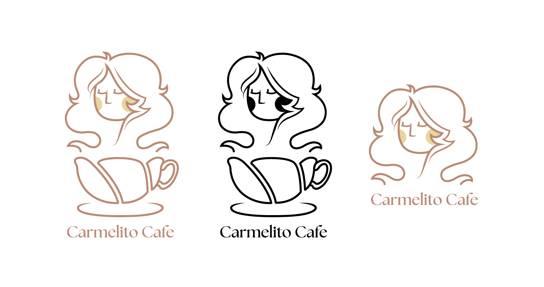
Carmelito Cafe
Redesigning the branding of a local Ottawa cafe
The objective of this project was to refresh Carmelito Cafe’s identity by redesigning their logo to better reflect their brand. The target audience included local customers seeking handmade pastries, drinks, and their catering services. The design had to adhere to a two-color restriction and be versatile for both print and digital formats. I conducted in-depth research on their existing branding to ensure the new logo aligned with the cafe’s values and aesthetics.
Programs
- Adobe Illustrator
- Adobe Photoshop
Categories
- Branding
- Illustration
Recreating the Logo
The project began by analyzing the existing logo to retain its key elements while updating it with a modern and elegant design. I researched the cafe’s history and their location's atmosphere to develop a fitting color palette of warm coffee brown tones. Through multiple concepts and sketches, I refined the design of the logo to look similar to the photo of Marilyn Monroe in the previous logo, transforming it to be more recognizable. This was then paired with a matching serif font to further push the elegance of the new brand identity.


A cafe Reimagined
The final result was a elegant, modernized logo that was easy to read and highly adaptable across various media. Compared to the previous logo, the color palette was more cohesive, enhancing the brand's overall presentation. In addition to the new logo, stationery and signage were redesigned to maintain a consistent visual identity. These elements further strengthen the brand’s tone of refinement and elegance.

Let’s work together
If you’ve got a project or an idea that needs to get done? Feel free to get in touch with me here.


